Your look, three directions
Three complete design systems, each built from something you already said or already do. They are shown in the order A, B, C, which is not a ranking. Pick the one you want to be.
See the finished brand, built from your choice
A
Flat Daylight
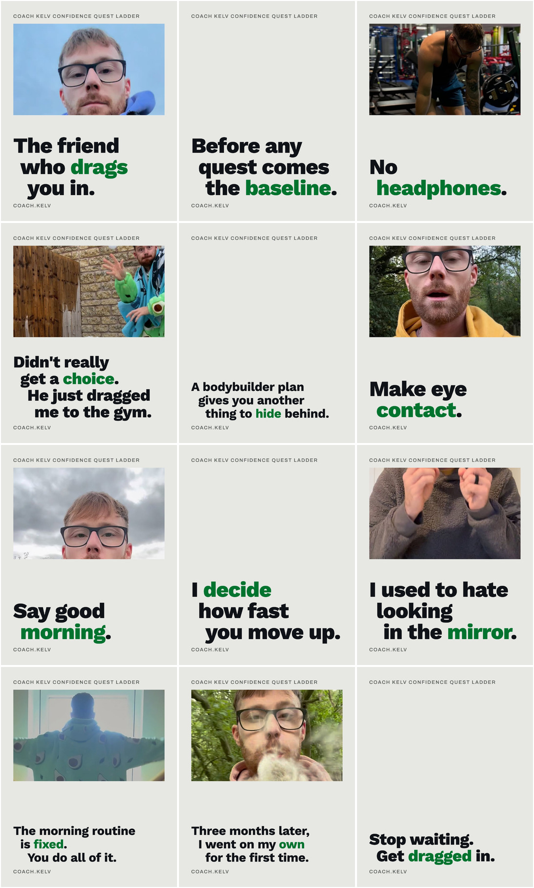
Out of the dark means the ordinary ten o'clock daylight you walked out into, so every word you publish sits on a flat sheet of that daylight and the dark is only ever a photograph set inside it, never a ground to print on.
- green #00732F
- ground #E7E8E3
- Work Sans
See direction A in full
B
One Box Ticked
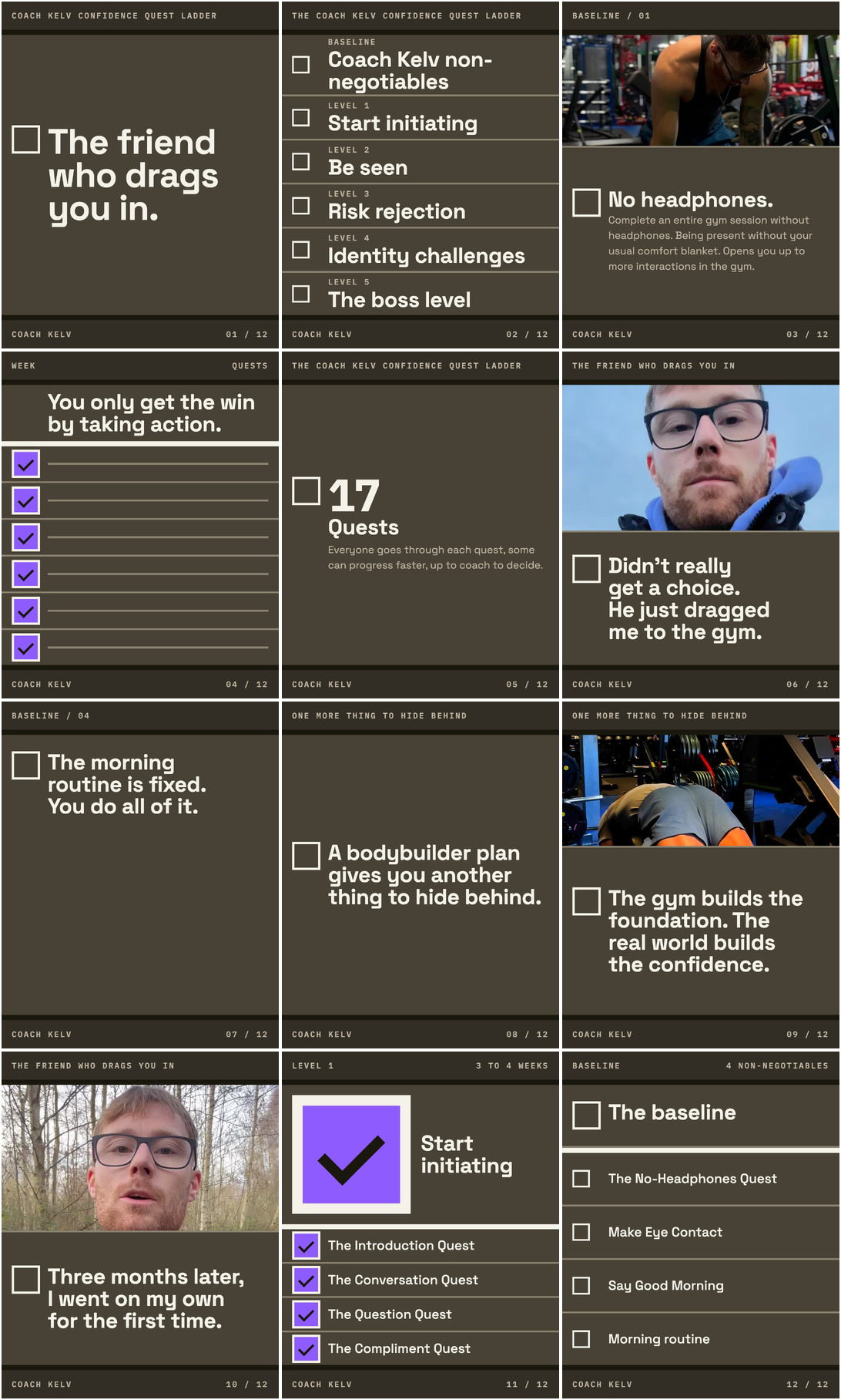
You already write your method as a numbered list with a coloured circle beside each band, so the look is that list: every piece is one item off the ladder, printed as a flat instruction with an empty box, and the one saturated colour only ever appears where something has actually been done.
- violet #8E5BFF
- ground #484236
- Space Grotesk
See direction B in full
C
Through The Door
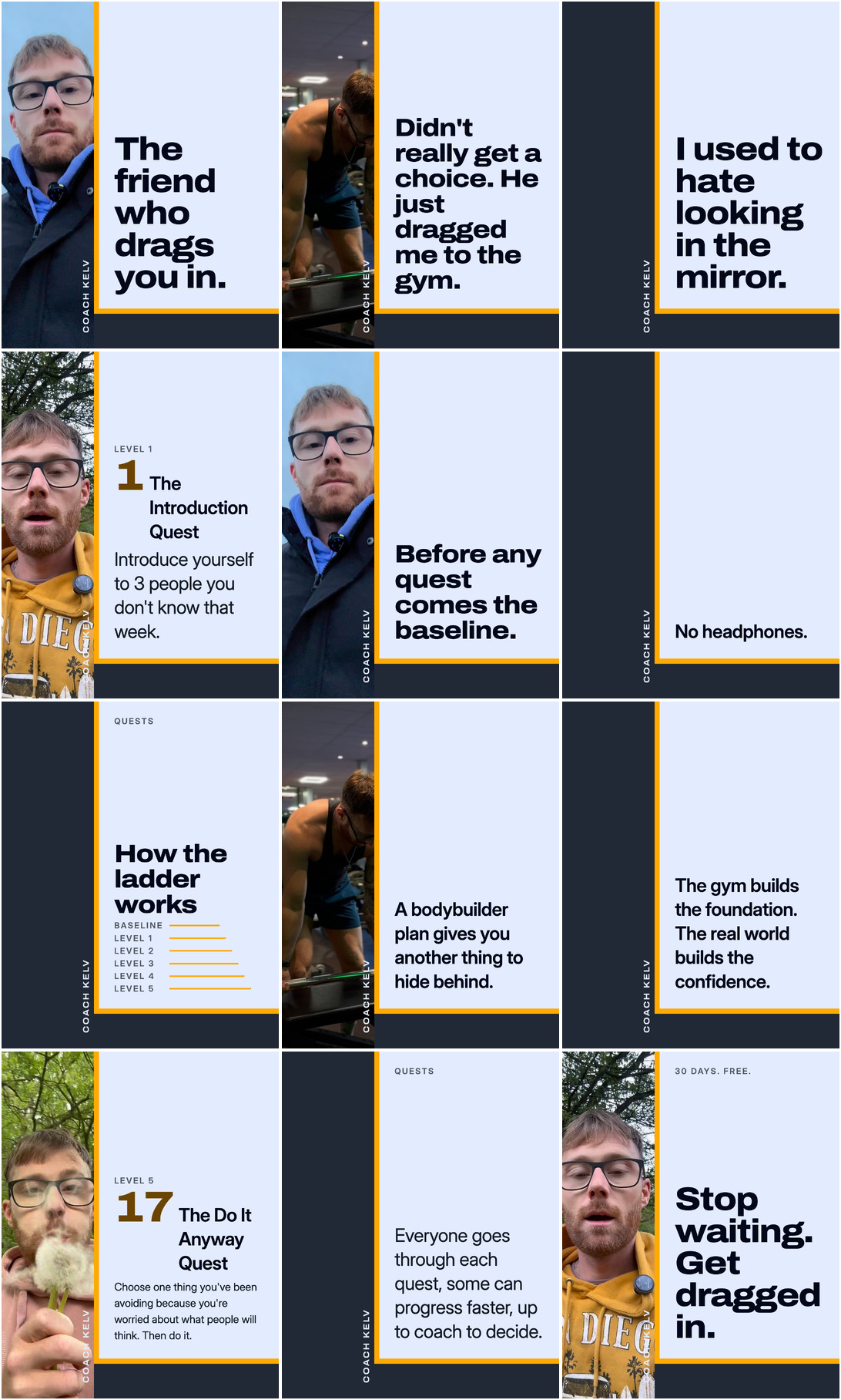
You are never the man already inside the room looking out, you are the door being held open, so every piece carries that threshold as a hard amber edge standing in the same place, with the left third left empty.
- amber #FFAA00
- ground #222936
- Archivo Variable
See direction C in full
How to look at this
Compare one surface at a time. Three profiles side by side, then three
ladders, then three covers. That is how the difference shows itself in a second, and it is why
the links below go by surface rather than by direction.
The words are the same in all three, and so are the pictures available to them. What changes
is the system: the colours, the two typefaces, the thing that repeats, how a photograph is
treated and how a page is built. None of the three has had the picture session yet, and that
session is the first thing the one you pick would get.
Surface by surface
Each of these shows the same surface in all three directions, side by side, at the size it is
really served.
The eight that decide it
- The profile block The only surface every visitor passes. Avatar at its real size, display name, the four bio lines, the link button, the highlight row.
- The pinned three The only place the relaunch is stated, because nothing gets deleted and the grid stays mostly old work for months. Three tiles that read as one triptych.
- The cover set, four type cases What replaces a logo, at 156 to 208 a year. The same system under four loads, plus the reel canvas that the grid crops again.
- The quest ladder as one designed object Twenty one rows in six bands, in the three media it actually ships in. A system that works in one of the three is not a system.
- The story frame set The documented first step of every lead he has taken. Draw the platform safe bands as a dimmed overlay so it is clear the type survives the chrome.
- The challenge landing page Where the ten to fifteen signups come from. Scrolled and shot at full length, phone first.
- The quest card The atomic unit of the product, 210 to 315 issuances in the first intake. Two cards, because the baseline items carry no number and the quests do.
- The DM attachment card The highest frequency designed artefact in the business at 2,600 to 4,160 sends a year, and it was never on the list. It arrives at about 250px wide, which is the test.
The rest of the system
- Carousel, three structural types His best format at 1.33x median engagement. Three different shapes, not one shape three times: a story slide, a method slide, an argument.
- Five highlight covers Permanent profile furniture. Authored full bleed, then cropped to the circle at real size on the profile mock. The circle crop is the hardest identity test in the set.
- Twelve tile grid montage The whole, judged by eye at the size a phone serves it. Written by scripts/render-mocks.mjs, not by this pipeline.
- Level completion badge The only proof loop that needs no consent, and he has consent for nobody. The most purely graphic object in the set: no photograph, no long copy.
- Weekly recognition card Greenlit 24 August, 52 a year, and Jonny already runs the format.
- Sign up form and confirmation The only interactive surface in the set, and where cheap design shows immediately: field height, focus state, button weight, error state.
- Burned in caption style 876 of his 1,194 posts are video and the caption look is a CapCut default, which means nobody has decided it.
- Lead magnet spread The only surface that tests body copy at length on a fixed page with no scroll and no photograph to carry it.
The three a builder needs and you do not
- The type specimen Layer 3. Every style in the scale set in its own face, at its own size, with its own tracking, in real locked strings, so a designer can see the whole ladder at once and pick from it. The second board is the measured detail the token file already carries: the ratio, the tracking band by band, and both canvases.
- The misuse board Layer 12. What this system must never do, drawn wrong on purpose with the right version beside it, both labelled. A rule written as prose is read once; a rule drawn is what a builder recognises at speed, which is when the mistake is actually made.
- The handover sheet Layer 14. A4 at 150dpi, two sides. The pasteable tokens on the first, then what is built, what the rules are and what a builder checks before publishing on the second. The contract's phrase is a folder anyone can open.
The three colours, against the ones already in use
Thirteen accounts selling to the same man were measured. Ten run exactly one accent colour and
none runs two. Your account runs three today: a violet type colour, a magenta to violet logo
gradient and a lilac band. That is the rule it breaks, rather than which colour it picks.
-
A. green #00732F
on #E7E8E3
-
B. violet #8E5BFF
on #484236
-
C. amber #FFAA00
on #222936
The three are a green, a violet and an amber, so no two of them are
competing for the same place in your grid. Not one of the thirteen accounts uses violet,
purple or magenta. Violet is not the only hue nobody runs: the ten accents measured sit
between 0 and 194 degrees and then jump to 347, so the empty stretch is about 153 degrees wide
and holds blue and indigo too. What violet adds is that you already run it: what is broken on
your account today is not that colour, it is that there are three of them.
What happens next
Tell Caspar or Andreas which letter you want. Nothing on these pages is live: no post is
scheduled, no page is published, nothing is deleted from your account. The one you pick becomes
your colours, your two typefaces, the one thing that repeats on every piece, the places you film
and a folder you can hand to anybody.
