
Direction B
One Box Ticked
You already write your method as a numbered list with a coloured circle beside each band, so the look is that list: every piece is one item off the ladder, printed as a flat instruction with an empty box, and the one saturated colour only ever appears where something has actually been done.
The grid
Twelve pieces in a row, which is how a stranger meets an account. A look shows itself across twelve tiles. One cover cannot carry it.
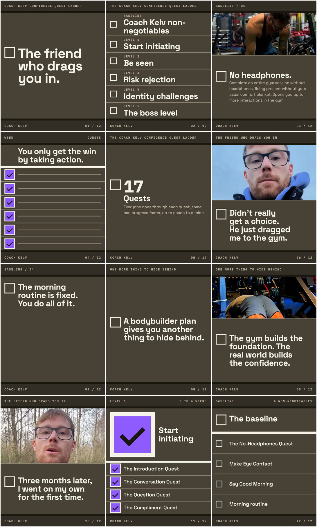
Twelve tiles on near black, five of them type with no photograph at all, and a small empty box that appears on ten of them and fills with the accent only where something has actually been done.
Worth knowing. The photograph on the pinned cover is a stand-in. What ships is the frame at the kitchen table from the picture session, which has not happened yet. Three frames carried a maker's wordmark, on two ice tubs and across a vest, and every one of them is cropped until it leaves the frame. In the frame at your shelf the book spines stay in, because a crop that took them out took you out with them, and none of them is a brand of yours or a partner. The one filled box in the grid reports your own morning routine. It is not a client result, because nobody has given consent, and it is not a finished item either: your written version of that routine is still owed. If a filled box has to mean a finished thing, that tile needs a different one of your four.
What choosing it means
Finishing the ladder before the first post, because this look prints your method and has nothing to print until every quest is numbered and written down.
It commits you to
- Every piece is one item off the ladder, numbered, with no unnumbered tip, no motivational quote card and no general confidence thought. If it cannot carry a number and a box, it does not go out.
- You write the morning routine text you still owe.
- Volume drops. You are running two a day, so this runs three to four pieces a week, each one a finished item rather than a filled slot.
- Covers get built from one Canva template with the two faces loaded once, and CapCut keeps the video and one fixed caption style and nothing else. You stop typing headlines free-hand inside it.
- The accent never decorates, and it is the rule a week of drift can break: no accent border, no accent glow, no accent heading, and if nothing in the frame is done there is no accent in the frame.
- You shoot in three named places and keep the lower third of every frame clear. The boat, the hotel room, the Iceland road sign, the supermarket self checkout and the cafe terrace stop being sets.
- Magenta, the lilac banner, the brush-script COACH KELV ring and the AI peacock are retired on the same day, along with PROJECT CONTROL wherever it still stands. The violet stays and goes down to one value.
- Before and afters keep running but stop being the hero: they become numbered, dated client cards on the dark ground, and not one ships until written consent exists from that man.
The pieces
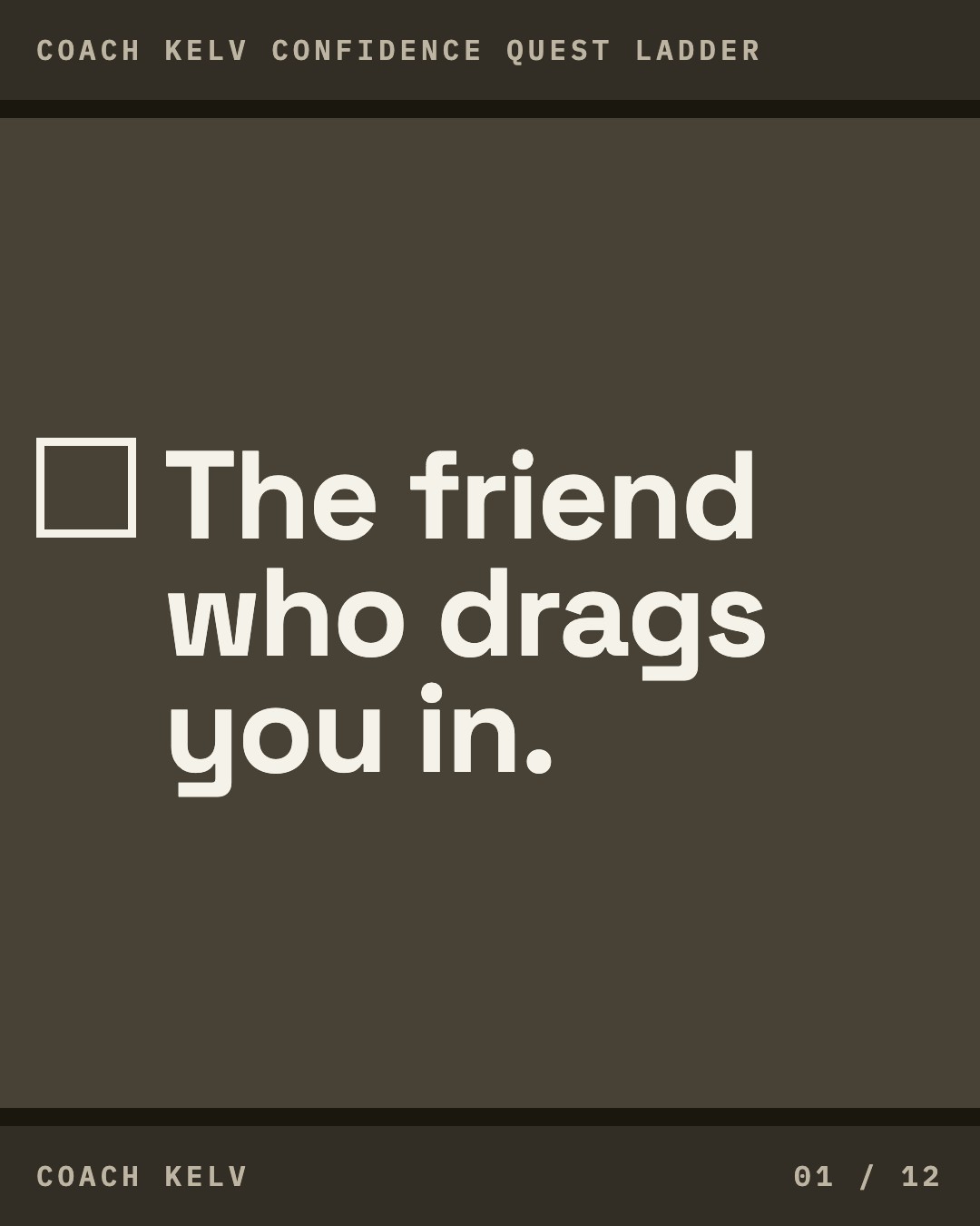
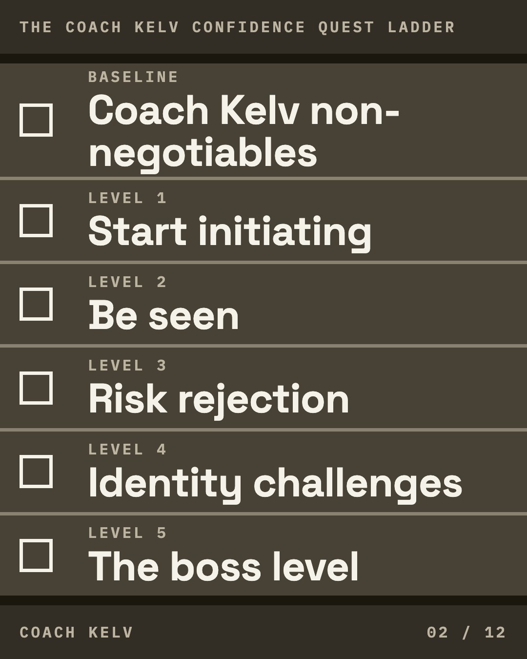
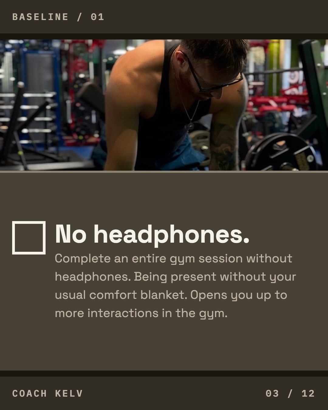
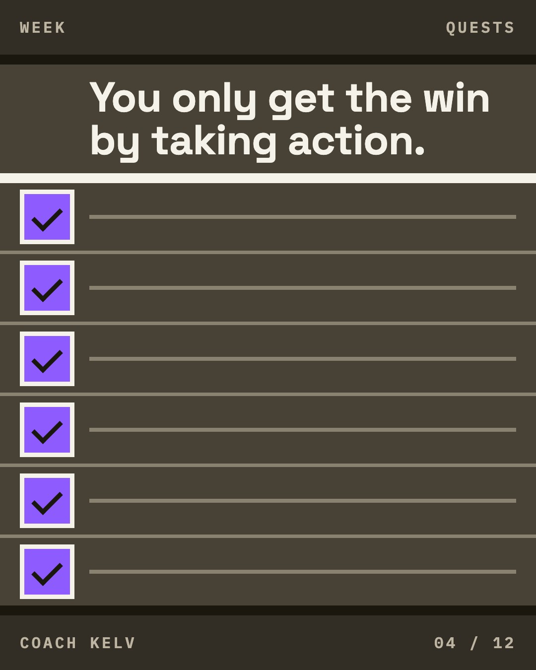
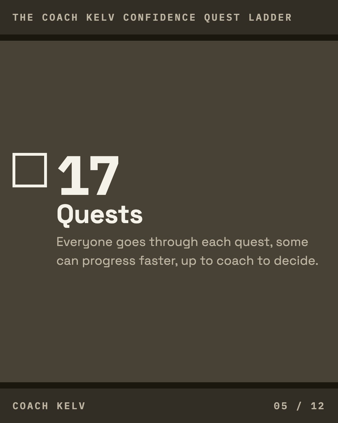

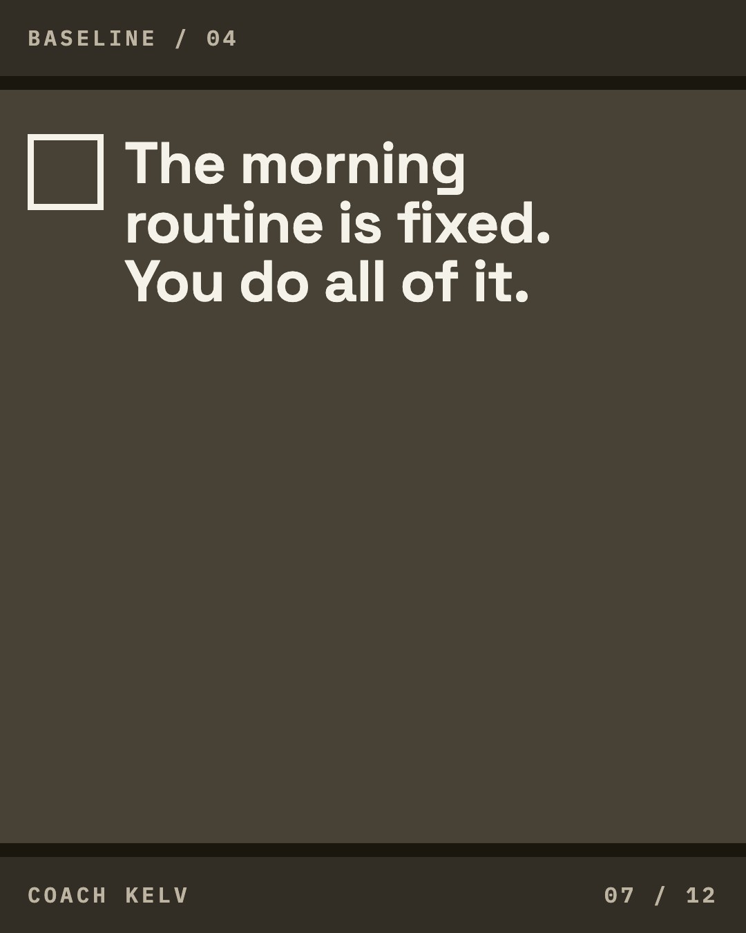
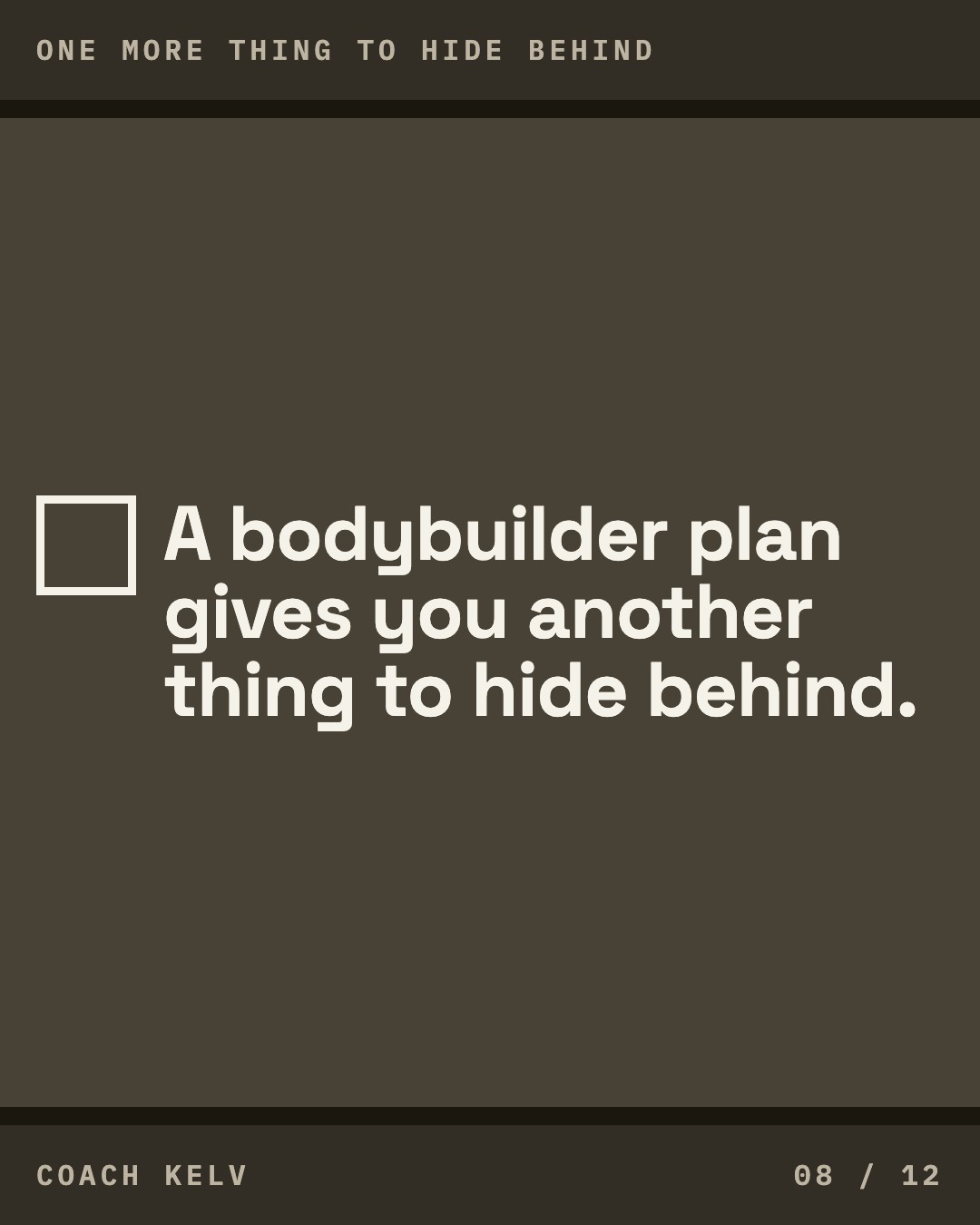

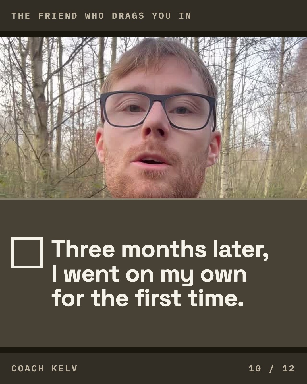
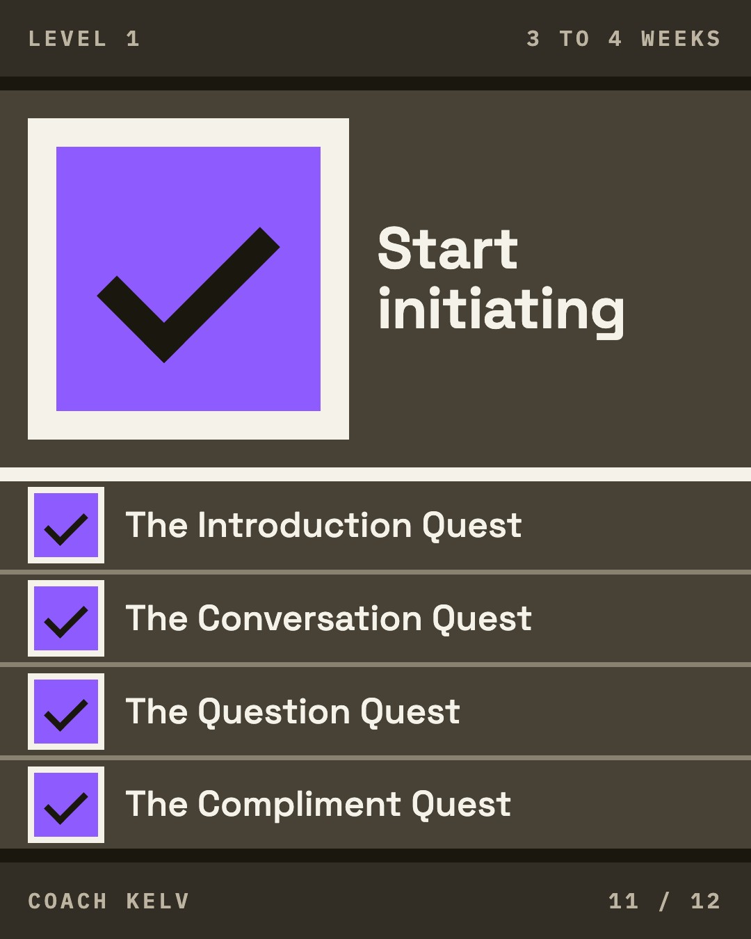
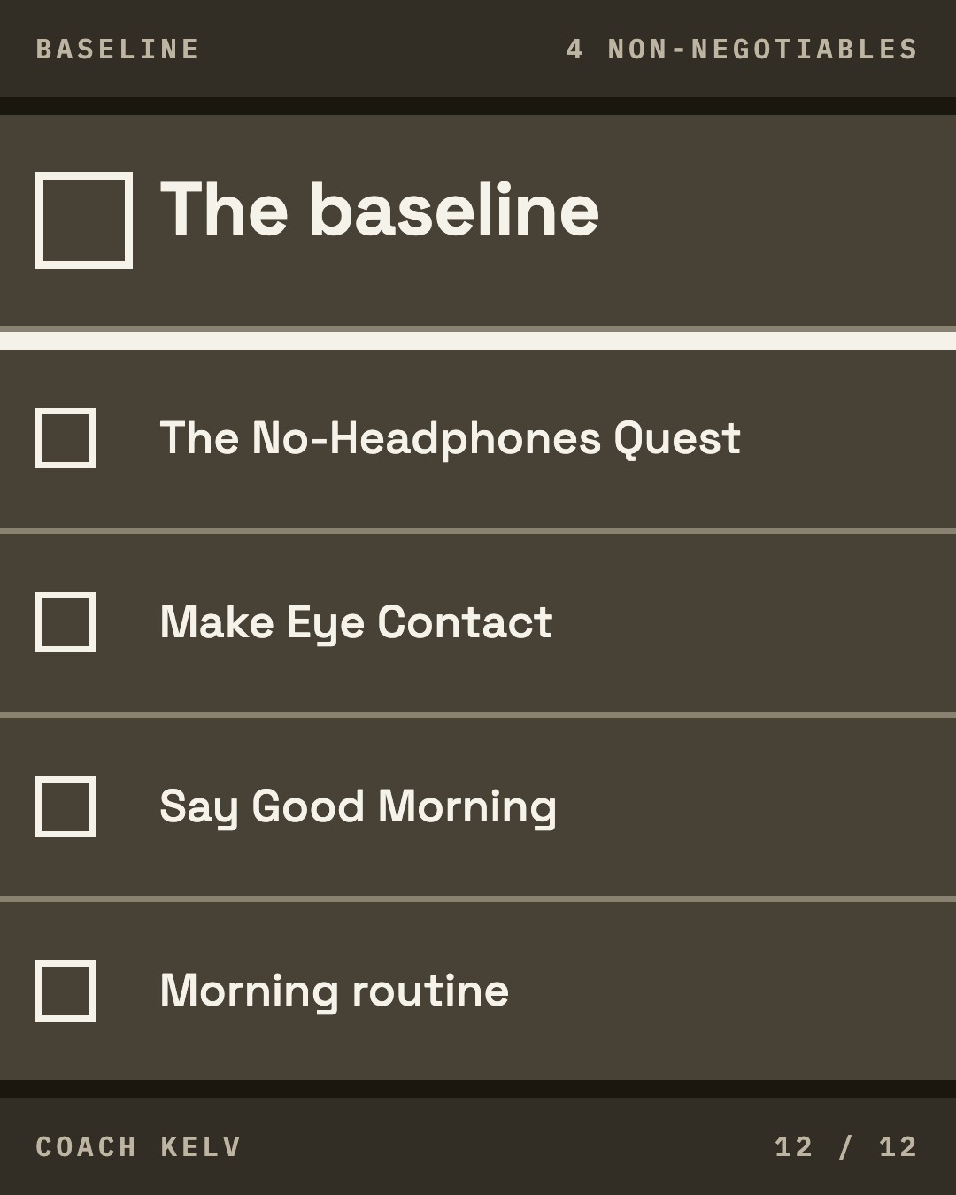
Tile 01 is the pinned cover. Your photograph full bleed with a dark bar across the bottom carrying an empty box, the eyebrow and the sentence on three lines.
Worth knowing. The tall version of this cover, the one that survives being posted as a reel, is written down and has not been built. What you are looking at above is the grid tile, and the two agree on the photograph, the bar, the empty box and the three lines. The photograph is a stand-in for the frame at the kitchen table from the picture session, which has not happened yet.
Carousel: The friend who drags you in
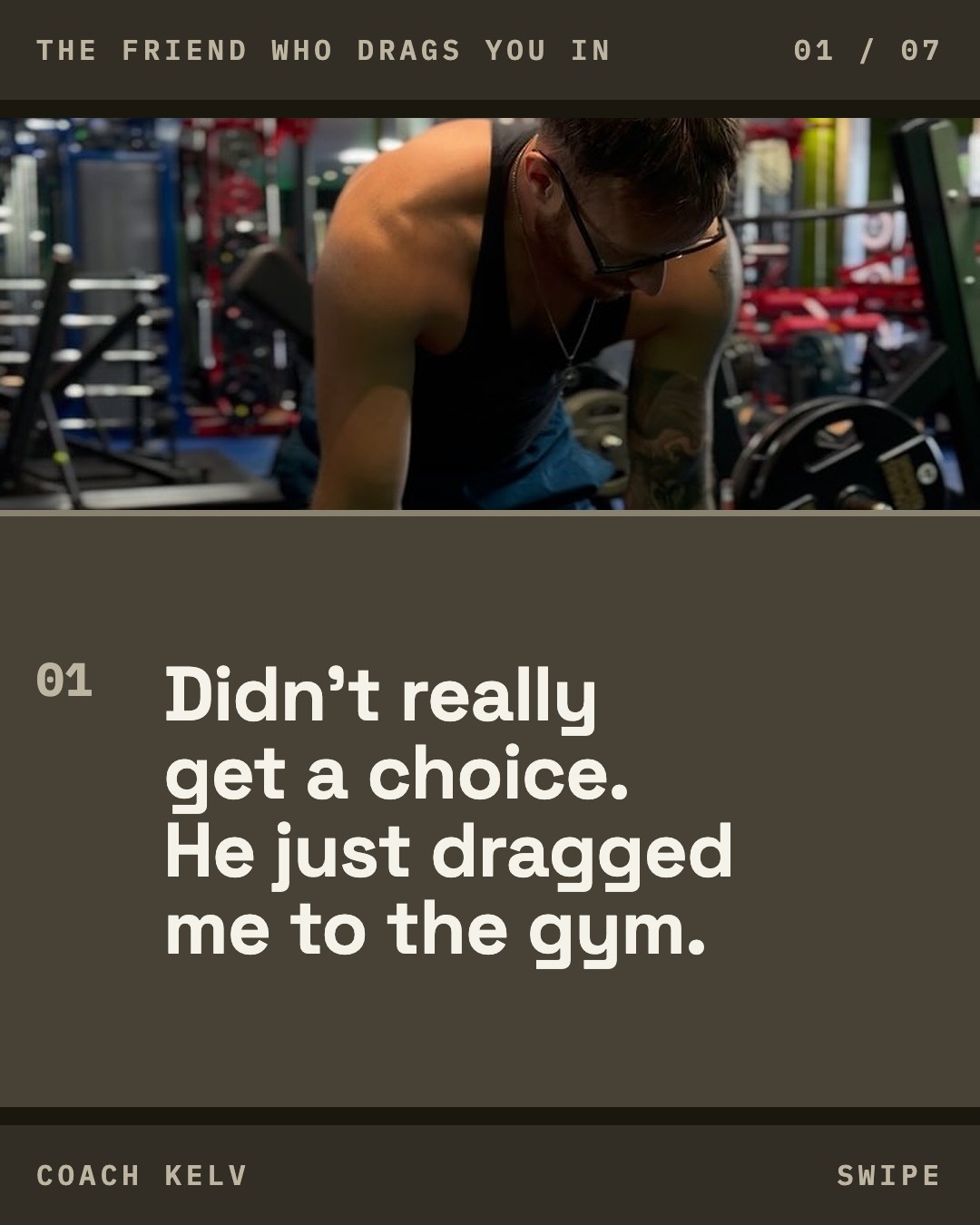
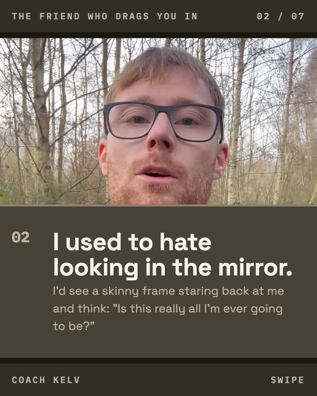
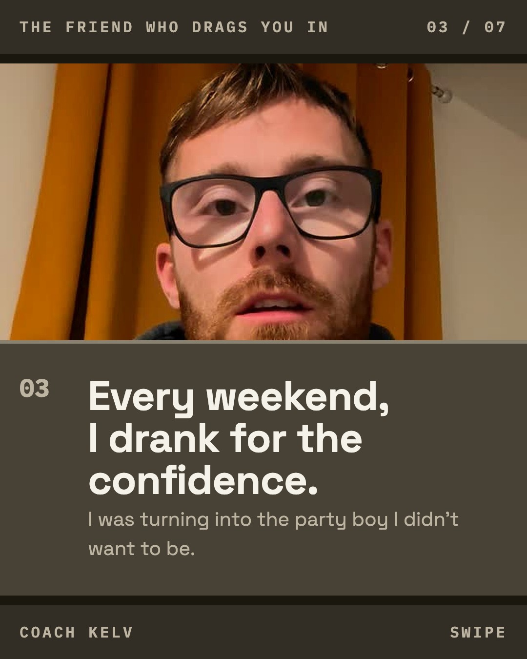
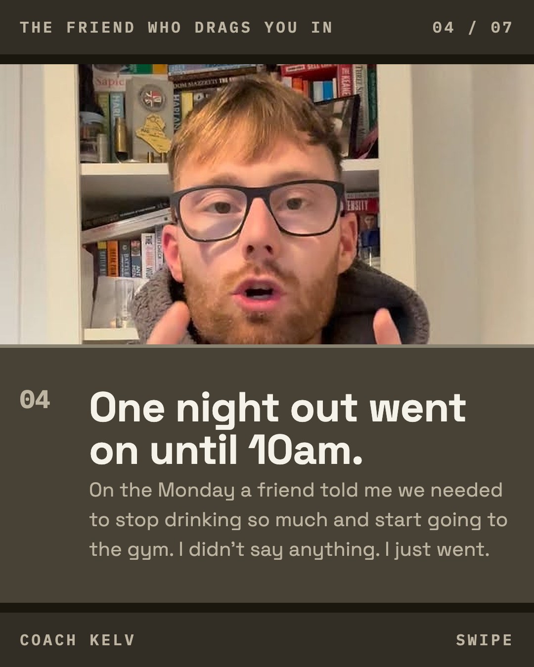
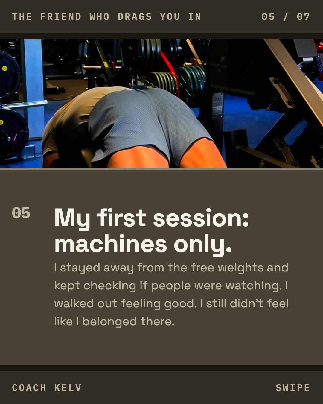
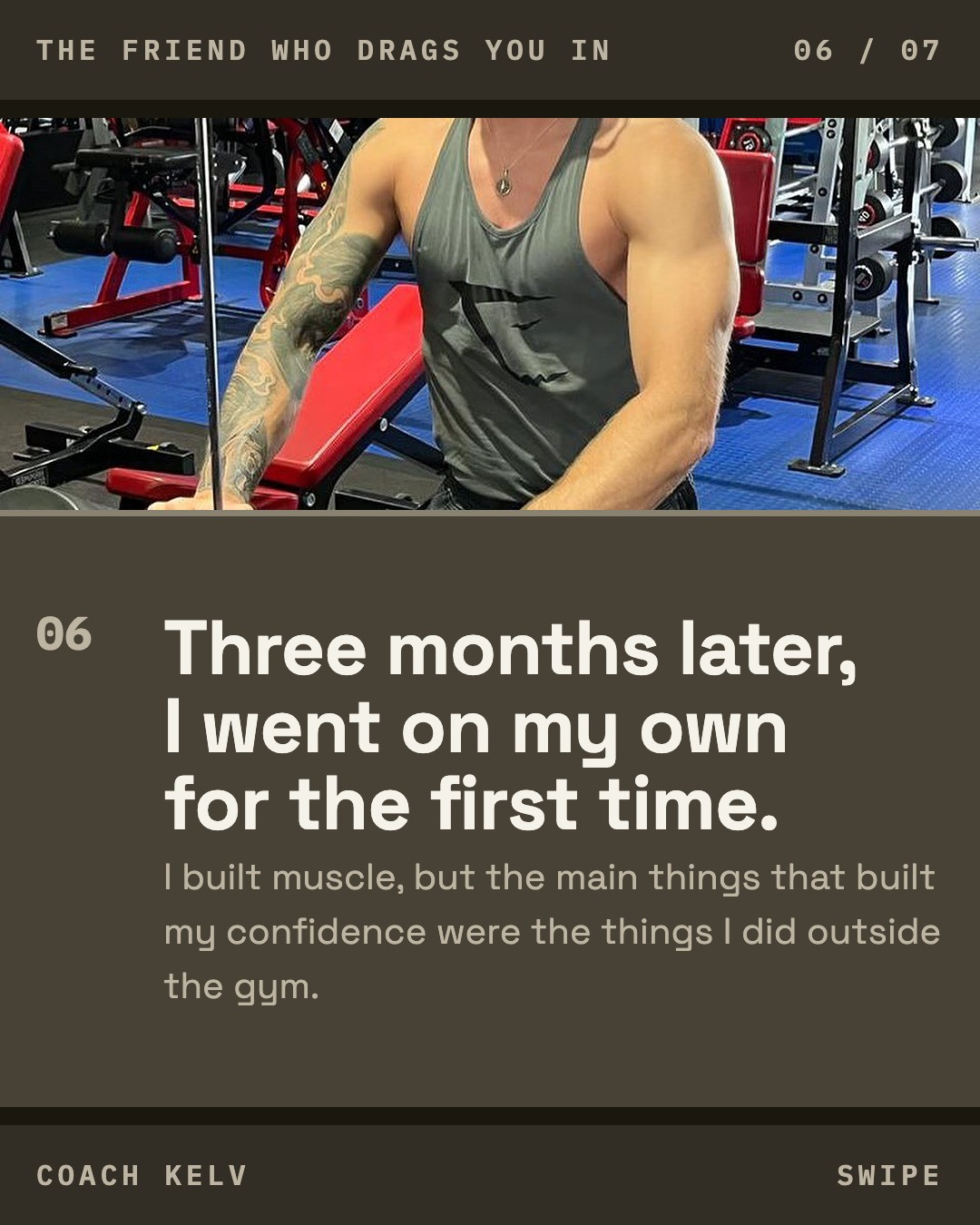

The same words in all three directions, so the comparison is the look.
Carousel: The baseline
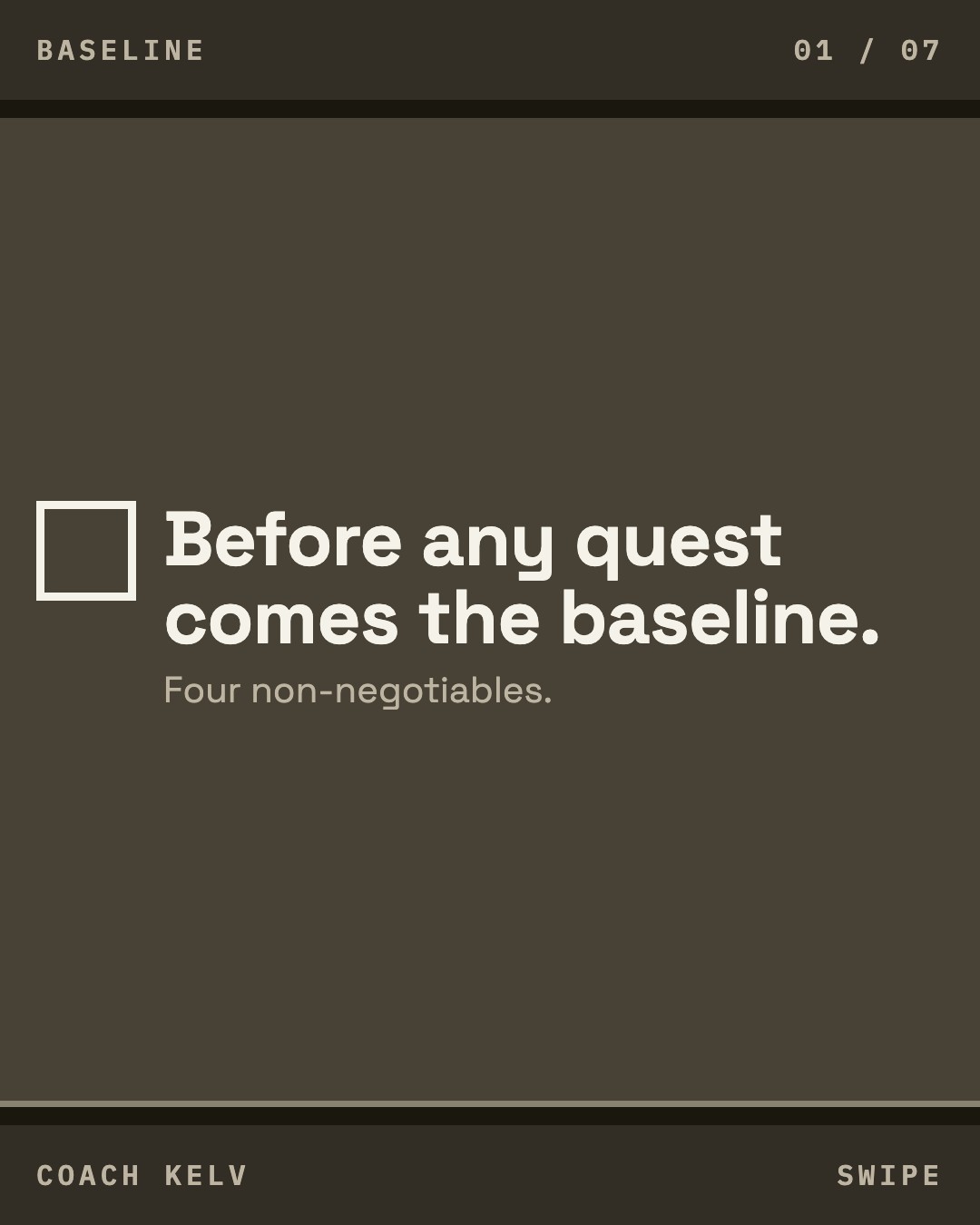
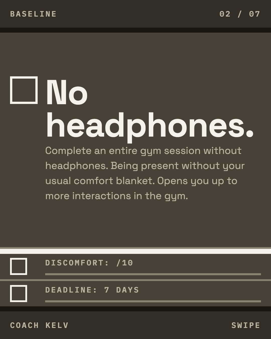
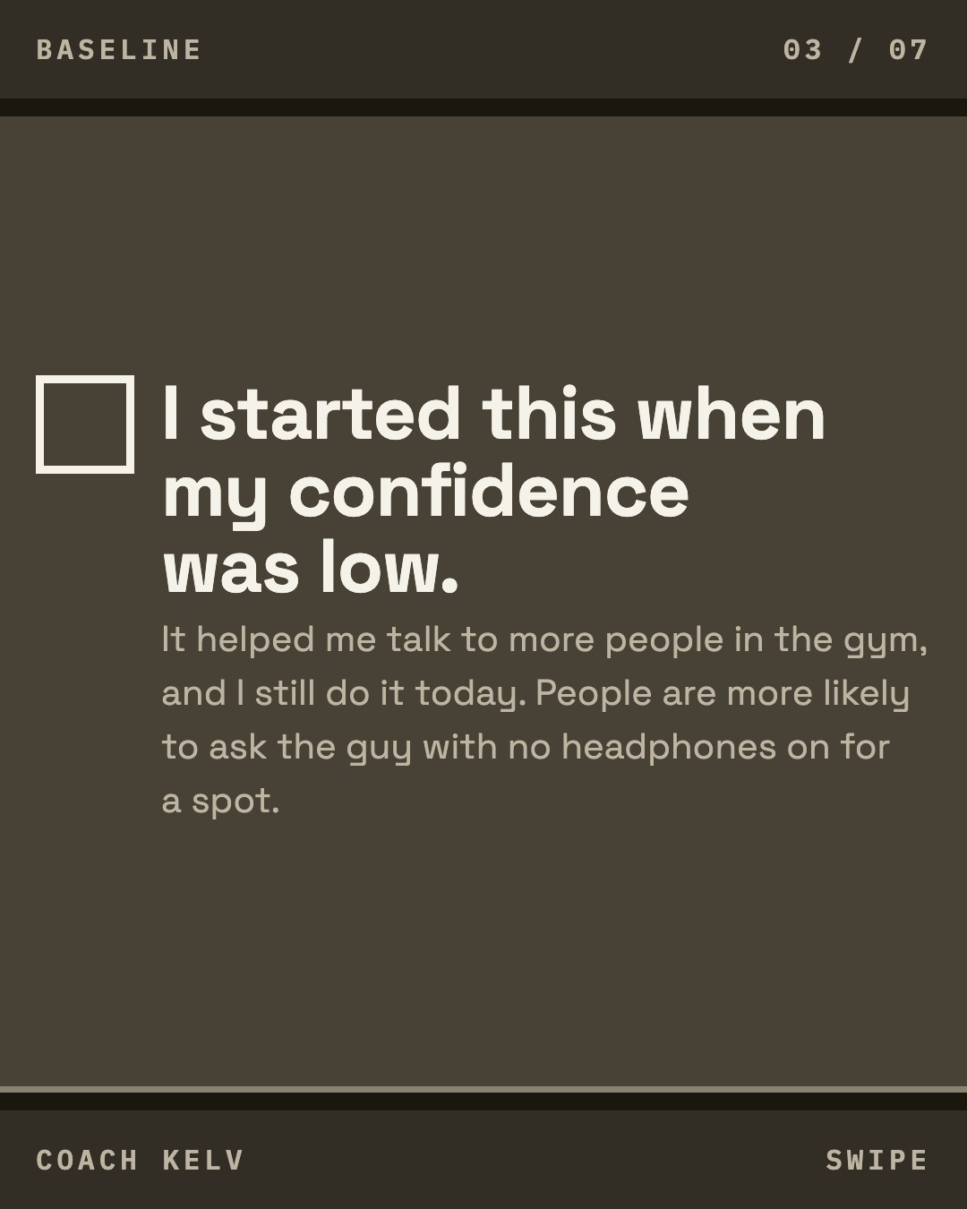
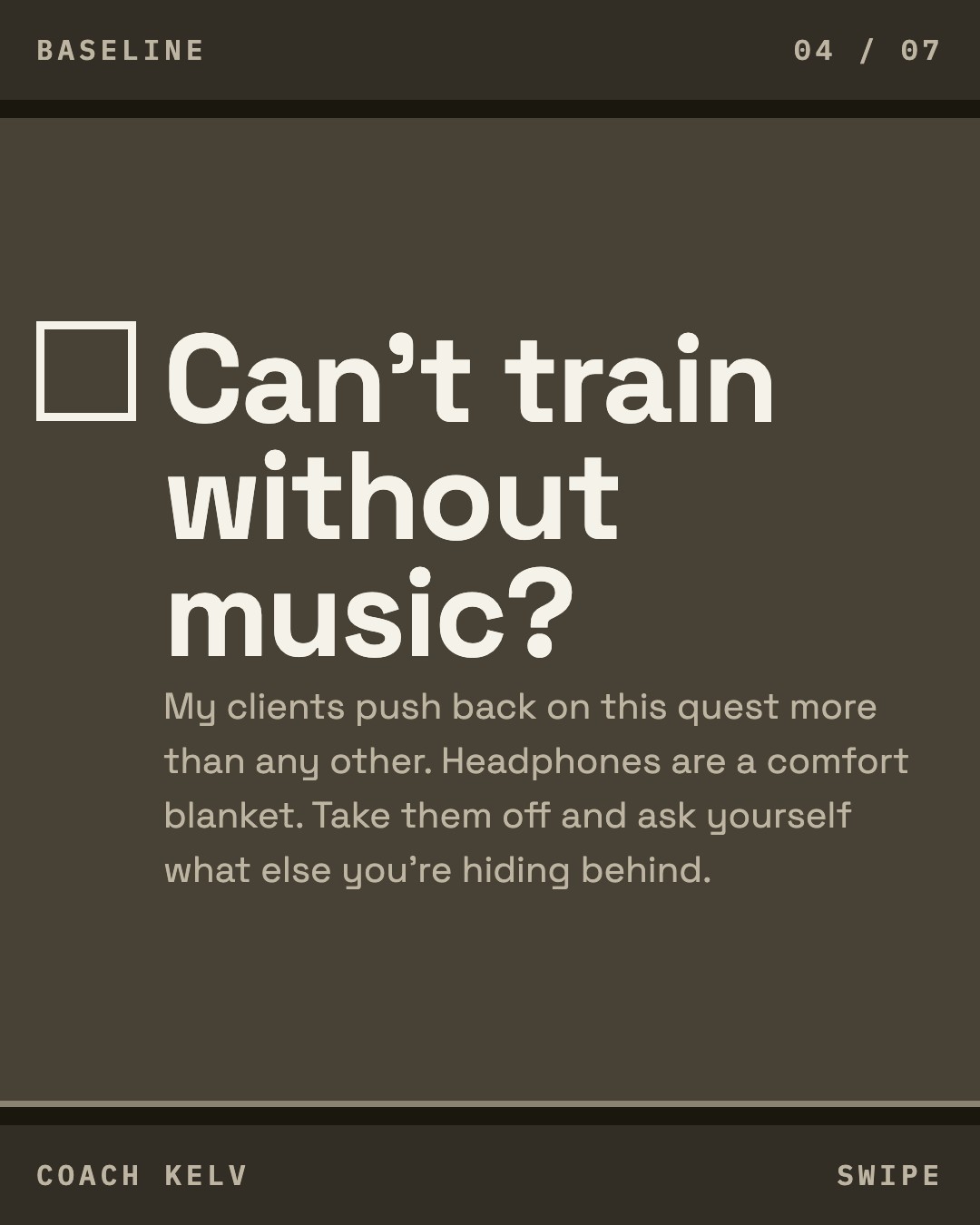
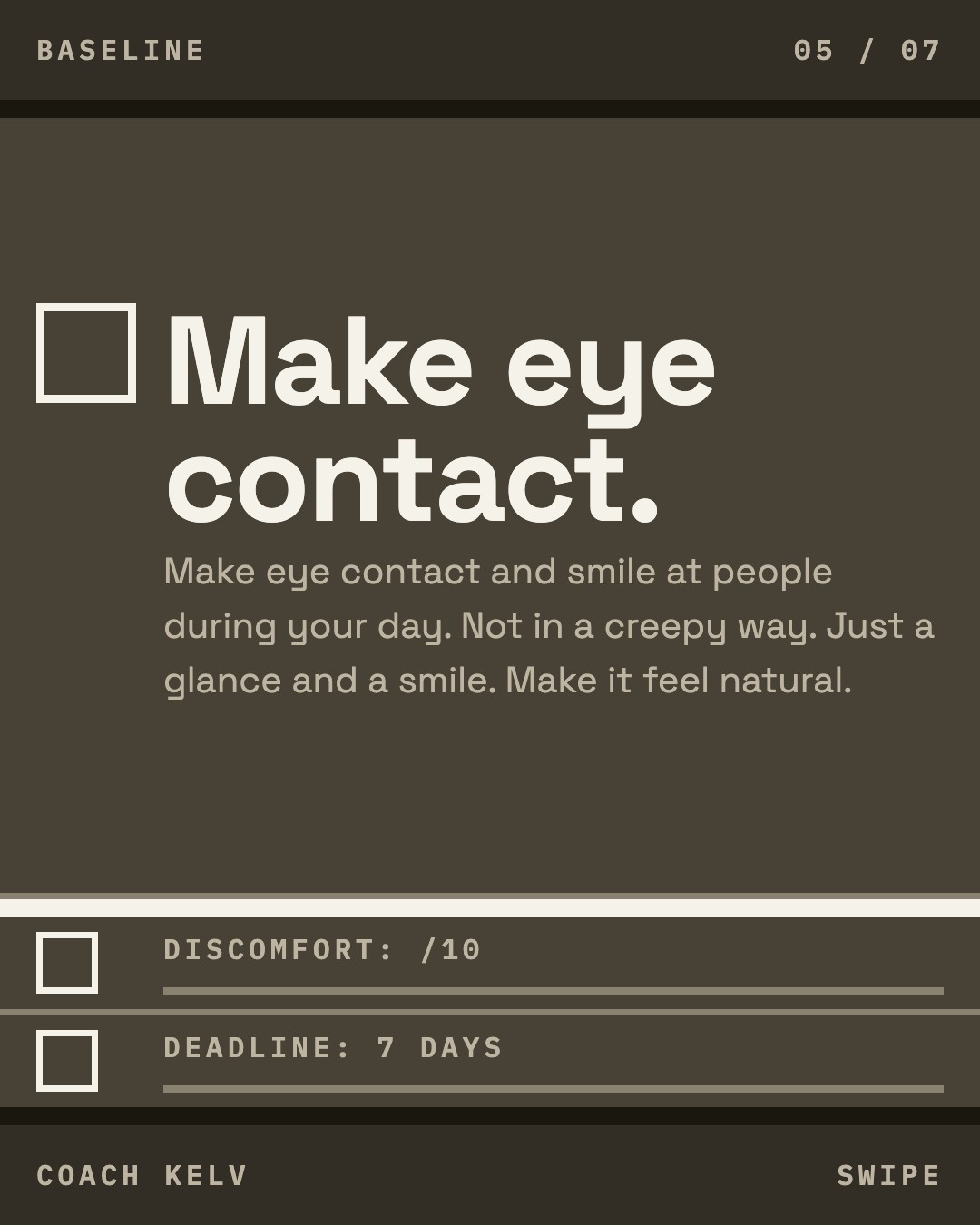
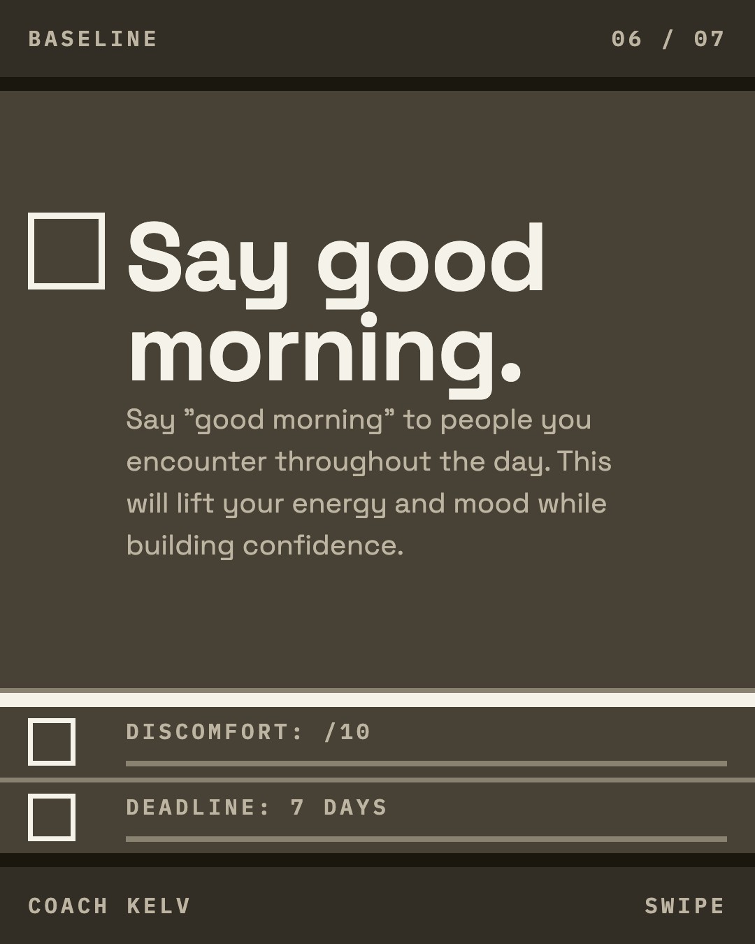
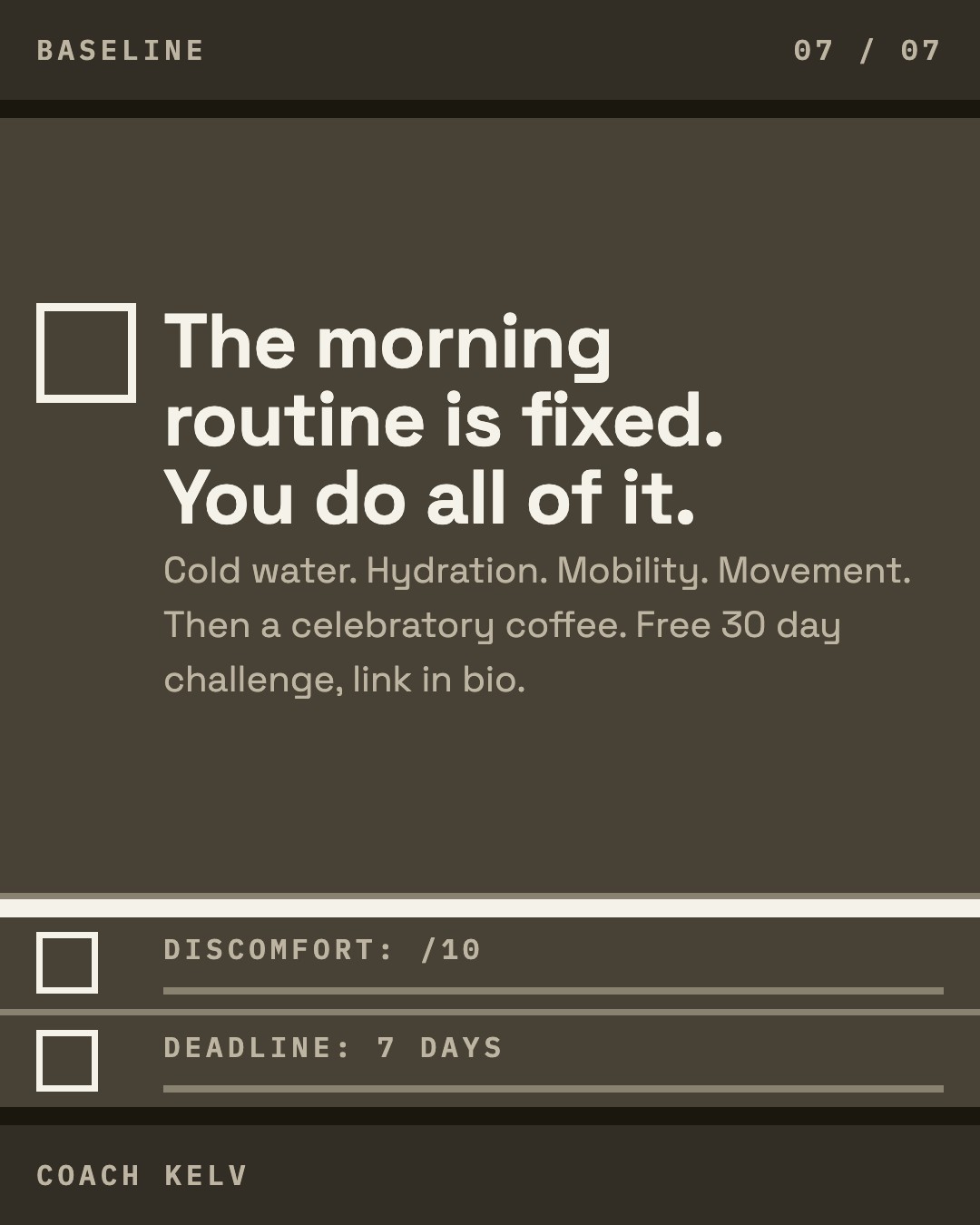
The same words in all three directions, so the comparison is the look.
Carousel: One more thing to hide behind

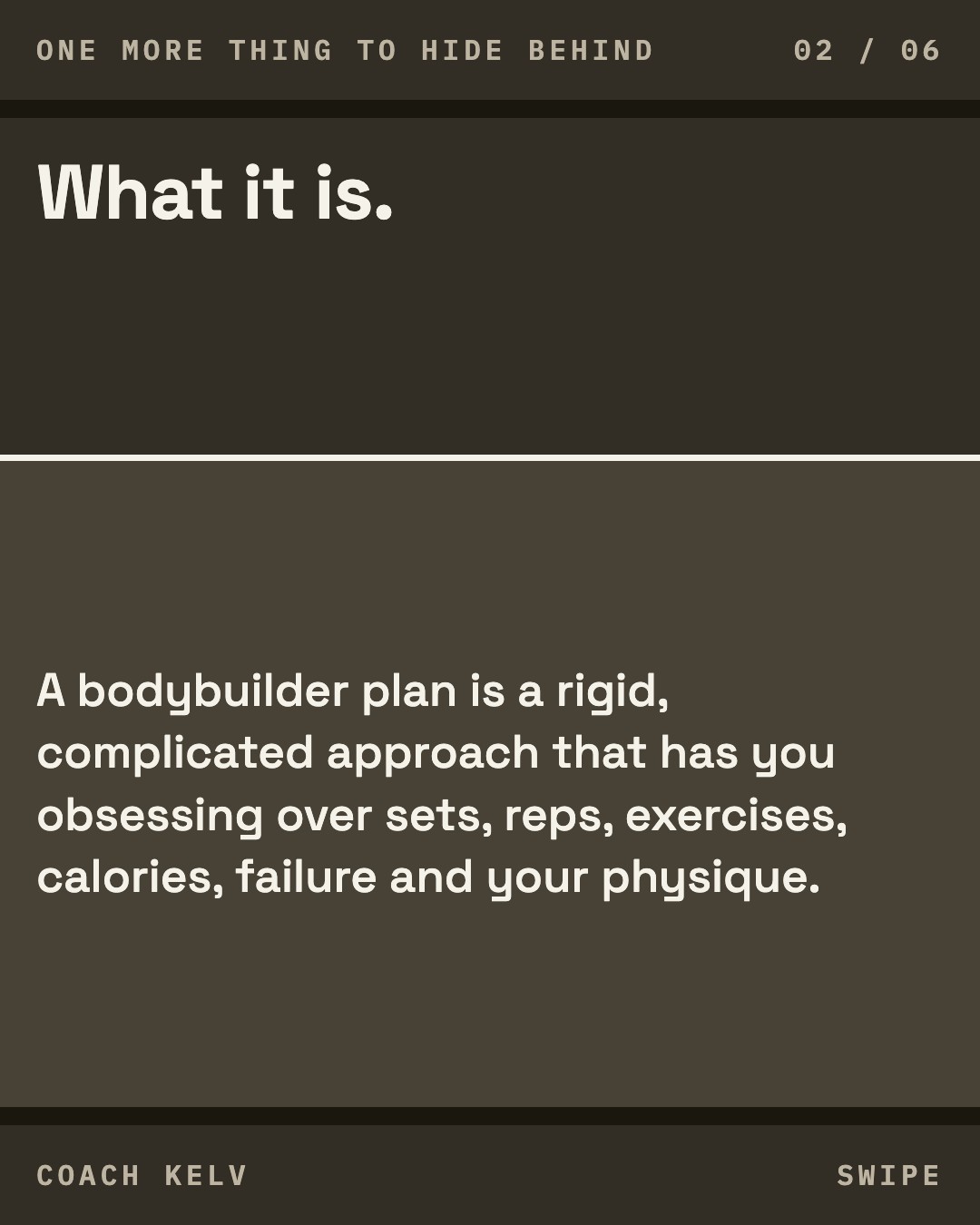
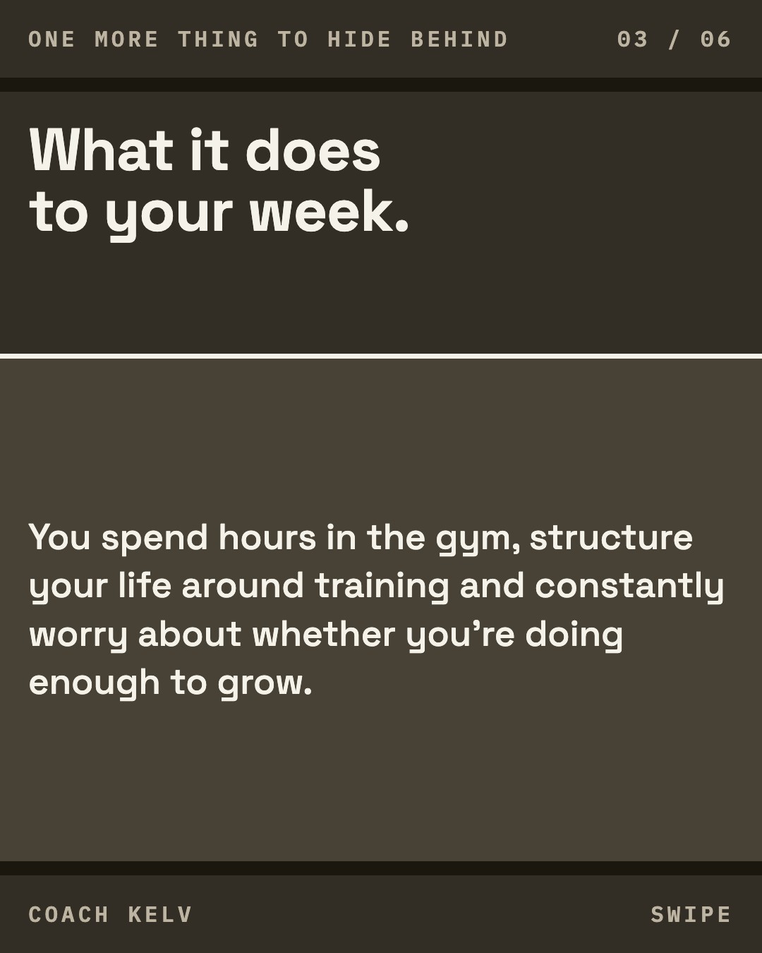
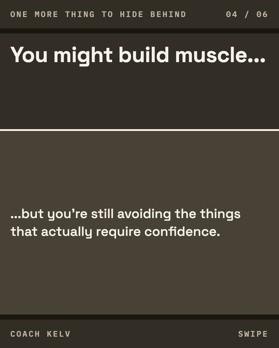
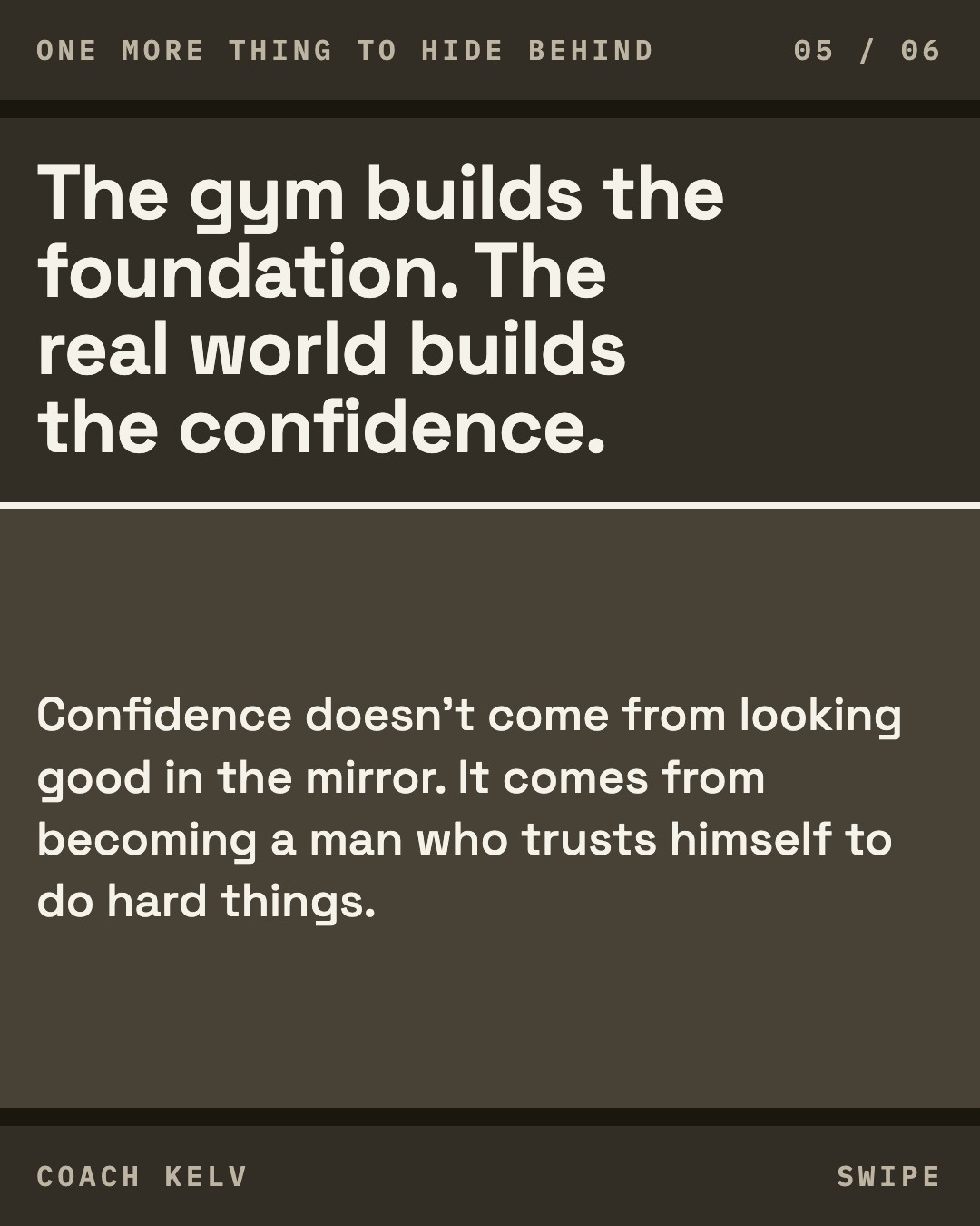
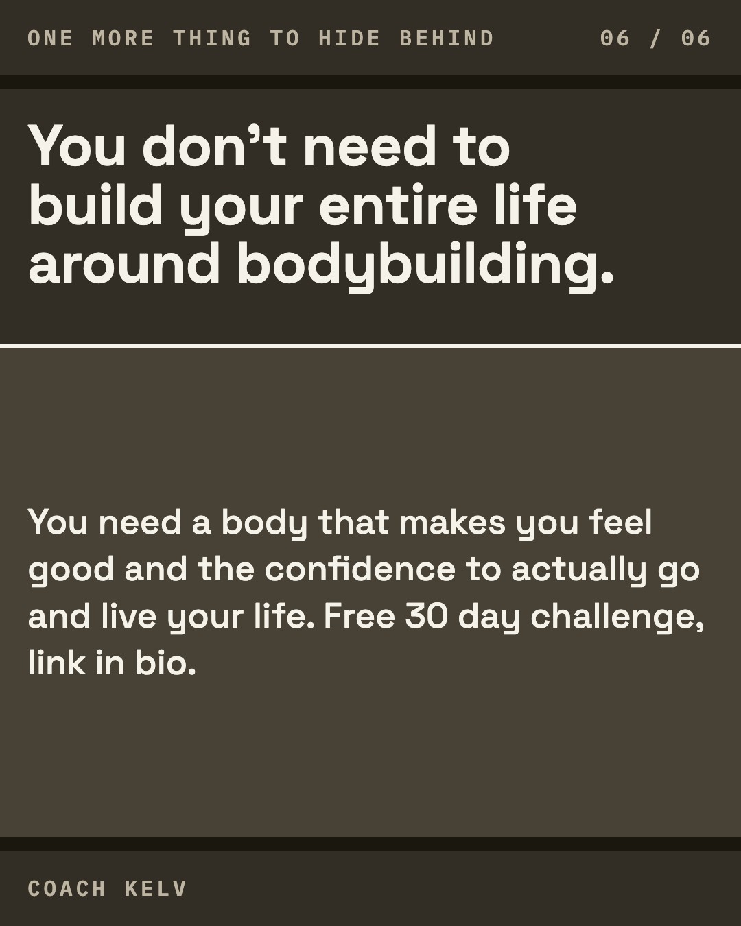
The same words in all three directions, so the comparison is the look.
The profile
What a stranger meets first: the avatar, the name, the bio and the twelve tiles underneath.
About the words in the bio. The three lines are your own: the sentence you picked, your line about the gym and the real world, and the DM you already run. They are not the final bio, and the name above them is a stand-in rather than a proposal. What your profile says today is "Kelvin Arnott - Confidence Coach", then four lines starting "Helping skinny men build muscle and unstoppable confidence". The open question is which lines you keep, not how the name is punctuated. It gets settled separately, and all of it reads the same in all three directions here, so it cannot tip your choice one way or the other.
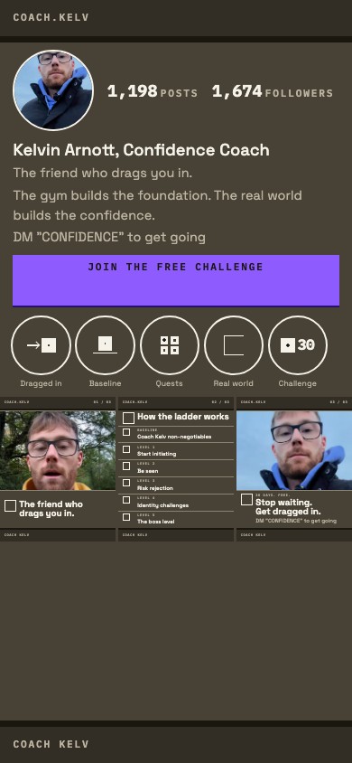
Your face on the dark ground with nothing over it, and the box that repeats moved off the avatar and onto the five highlight covers under it.
Worth knowing. The avatar is one of your existing frames and carries no third party mark. The box on the highlight covers is drawn bigger in this mock than the real artboard sets it, on purpose: at its true proportion on a mock this small it would be invisible, which would test nothing. The two counters carry the numbers measured on your account on 21 August 2026, and they are the same two in all three directions, so they cannot tip your choice.
The landing page
The free 30 day challenge page, built in this direction.
The hero is your ladder rather than a photograph: twenty one rows in the right hand column, the four baseline items filled in and the seventeen quests above them still empty.
Worth knowing. The photograph in the band under the hero is a stand-in until the picture session happens. Its crop changes with the width of the screen: on a phone it runs taller, so the book spines behind you are readable rather than merely present. A part covered chest logo is in frame at every width, because no crop of that frame takes a mark off your body. None of them reads as a partner, and the small dark object on a chain at your throat carries no mark and stays.
What the expert panel said
Nine expert notebooks were asked about these three systems on 13 September, each through the same brief, in the same words, in the order A, B, C and with no recommendation. All nine answered. Eight of the nine opened by saying their own sources carry nothing about typefaces, colour or layout, and then judged the three on what those sources do carry: whether a stranger understands the piece, whether the packaging is clear rather than clever, how much work each system is to keep up, and what a brand actually is. That is the honest answer to a design question put to a shelf of messaging sources, and it is why this round is usable. Round 1 had six chairs abstain outright. This one has none.
Nobody refuses any of the three. Second round running, same result. Round 1 produced three refusals, all of C, and all three named the same requirement, that every photograph be shot at a real doorway. That requirement contradicted C's own build and was removed, and nothing here brings it back.
Where each one was attacked
Shown in full on all three pages, because a criticism raised against one look can bear on the others, and three of these do. Where something could be measured rather than accepted, it was measured, and the answer is in the last column even when it goes against the chair.
| Raised on | The criticism | Chairs | Checked |
|---|---|---|---|
| A | The inset photograph breaks the category and weakens the human proof. Thirteen of thirteen competing accounts bleed their photographs to the tile edge. Holding the photograph above the bar reads as a corporate document rather than a transformation account, and it shrinks the face. | Chris Do, Colin and Samir, Gray, Gaudet | Not checked. It is a judgement about what his buyer expects, and the category count it rests on is ours and is correct. |
| A | The stepped stack adds reading friction without adding signal. Indenting each type group one step further disrupts the eye on a thumbnail scanned in under three seconds. | Chris Do, Gray, Gaudet, Hormozi | Not checked. The staircase is the one thing that tells A apart from the other two with the colour stripped, so removing it would cost the direction its identity. Held as a real tension rather than settled. |
| B (this one) | The mono voice and the checkbox read as administrative work. A compliance audit, a software manual, a classroom, a homework sheet: four chairs reached for the same class of metaphor independently, and none of them had seen the others. | Chris Do, Colin and Samir, Gray, Gaudet | Not checked. It is the clearest shared reading in the round and it is a judgement, not a measurement. |
| B (this one) | The unearned colour trap. The one saturated colour appears only where something has been done, so the feed a stranger scrolls carries no colour at all. | Chris Do | Confirmed by measurement and worse than he guessed. He reasoned from the rule without seeing a board and said ninety percent monochrome. B's violet covered 3 pixels of 1,983,072 on its own twelve tile grid, which is zero percent. A's green covered 0.24 percent. Both were then fixed and re-measured on the rebuilt grids: A's green now covers 1.16 percent, B's violet 1.17 percent and C's amber 5.01 percent, against a floor of 1 percent. So the swatch he is shown is now a colour that is actually in the account he would run, which is the thing the chair was really pointing at. The measurement is a gate, `scripts/accent.mjs`, and it runs on every build. |
| B (this one) | It strips his character out. The Oxford origin, the RAF, the losses, the transformation: followers buy identity, and a flat instruction strip carries none of it. | Gaudet, Gray | Bears on all three equally. The twelve tiles carry the same words in every direction, so this is a question about what goes in them rather than about B's system. |
| C | The empty left third costs a third of the frame, and on a 300px grid tile that shrinks the type below the point where it is read. Five of nine landed on this independently, which makes it the most agreed criticism in the round. | Hormozi, Chris Do, Colin and Samir, Gray, Gaudet | Measured and not supported, and the measurement moved against the chair twice. Every board is rendered at its own canvas and every font size scaled to the width a person is actually served. Across the five cover boards at the 300px a grid tile is given, the largest line averages 30.0px in A, 32.2px in B and 30.6px in C. C is not the smallest of the three, it sits above A. When the criticism was first checked C was a pixel and a half below A and one B cover sat under the floor; both were fixed the same morning, so the number quoted here is the one that stands now. Nothing in any direction falls below the size at which a line is read at a glance. |
| C | Grid monotony. An identical geometric split in the same place on every tile turns the profile into wallpaper the eye deletes. | Colin and Samir, Gray | Measured, and the chairs are right. This column said the seam steps by level and that nobody had measured it. Both halves were wrong. Measured off the twelve rendered tiles on 13 September, the 20px amber column stands at x=360 to 379 on every one of the twelve, covering 90 percent of the tile height, and the left edge does not move by a single pixel across the set. C's own open list on this same page already carried that number, so the page was arguing with itself. What the chairs called wallpaper is the direction's one device doing exactly what the direction asks of it, which makes this a cost of choosing C rather than a defect to fix: the identical placement is what makes twelve unrelated pieces read as one account, and it is also what a scrolling eye stops seeing. Nobody has measured how quickly it stops being seen, and that is the part still open. |
| C | Expanded heavy type in a narrow column produces erratic line breaks and awkward hyphenation. | Chris Do | Checked by a different gate and closed. A gate reads every artboard and fails any word broken across two lines with nothing to break on. It is clean across all three directions. |
Which one is hardest to keep up
The question built to separate them: which of the three is hardest to keep up alone, twice a day, with a full time job until February 2027 and no designer. They split, and the split is the finding. Note what it sits next to: in round 1 two chairs named A the strongest of the three. The same property, a composed layout with an inset photograph and a stepped stack, reads as craft to one question and as friction to another.
| Named hardest | By |
|---|---|
| A | Hormozi, Gray, and Chris Do and Gaudet who each name A alongside C |
| C | Chris Do, Gaudet |
| B (this one) | Colin and Samir |
| Cannot say | Koe, Miller, Sheridan and Ralston, who say their sources cannot compare build time, or that all three fail equally |
On what happens if he cannot keep it up they do not split at all. Friction stops the posting, stopping the posting breaks the repetition, and a brand is repetition. Colin and Samir give the test: judge a format on a 52 week window, because a production style that is even slightly depleting compounds.
What all nine agreed on, and it is not about the look
The part that does not flatter us, recorded in full because leaving it off a page that quotes the same nine chairs elsewhere would be selecting the flattering half. All nine push back on the exercise itself: not on which look, on whether a look is the thing to be building at 1,674 followers.
| Chair | What he says |
|---|---|
| Alex Hormozi | Branding is not about presentation, colours or logos. At this size the constraint is posting volume, the offer and lead flow. |
| Chris Do | A visual system is a container for meaning. Building this many boards for a coach whose offer page does not exist yet is decorating an empty container before putting any substance inside it. |
| Colin and Samir | Massive premature over-optimization. The principle being broken is cheap, fast experiments, and the rule that eighty five percent finished is good enough to publish. |
| Matt Gray | The Tinkerer Trap. Visual design belongs at the very end of brand architecture, after one platform, two repeatable formats and an automated capture flow. |
| Dan Koe | Procrastination disguised as productivity. Forget about your bio and banner and all of that stuff. |
| Donald Miller | Do not spend a dime on a marketing campaign until the five soundbites are written. Amazon is an ugly website that makes billions because its words are clear. |
| Marcus Sheridan | Ostrich marketing. Trust comes from answering pricing, drawbacks and comparisons, and from being on camera, not from a template. |
| Caleb Ralston | Anybody who is overthinking a brand style guide in the first year of their personal brand is wasting their time. A rigid matrix turns content into a prison rather than a personal brand. |
| Sam Gaudet | At this stage a solo creator should not be building type specimens, misuse boards or handover sheets. Topic over everything. |
Two things are true at once and both are left standing. The objection is real: nine independent shelves of sources say the same thing, several of them about the exact number of boards. And the objection is partly a property of who was asked: these are nine messaging, offer and content sources, and a shelf about content will say content is the constraint. What to do about it is a decision for Andreas and Caspar about the order of the work, not something this page settles and not something that changes which of the three you prefer.
Nothing here recommends a direction. Four of the five chairs who named a hardest to sustain named A, and two chairs named A the strongest of the three in the round before. Both are printed, neither is resolved for you.
What is still open
- The ladder's 21 rows are locked, taken from your own message of 6 September and the Caspar 1:1 of 11 September, so this direction can now print its central object and the mocks cite it rather than inventing it. Three things are still open on it. The morning routine text is still owed, so that row carries a name and no line and no mock prints one. The week-5 against day-one start is unresolved. Five levels against levels 1 to 10 has never been settled.
- Whether the method may be published at all is open between Hormozi and Chris Do, and it is a call on our side. A numbered instruction with a deadline sits very close to the how that Caspar's lead-magnet rule keeps back. It has to be decided before the first ten pieces, not after.
- The violet is the one hue none of the thirteen measured competitors uses, and the reason for choosing it is that you already run violet type on your account today. That second half is a reading of your posts rather than a measurement: no sampled value of your own violet exists, so the exact step is ours and not yours. Worth settling from a real frame before the first ten pieces.
- No frame of the kitchen table exists in 809 covers, so the direction's home set is unphotographed and the first mock uses a stand-in.
- Written consent exists for nobody, so the numbered client cards stay out of the day-one kit and the proof tile carries your own practice instead, which is a weaker claim than a completed item because your written morning routine is still outstanding.
- The line-up test has not been run on anybody. Both passes are outstanding and the accent pass has to run across all three directions together.
- Your confidence content runs at 0.67x your median and the skinny and hard gainer theme at 0.56, and that second one is a content theme label rather than an account, and nobody has established whether that is the topic or the execution. This direction leans into both themes and drops the question hook that 8 of 13 accounts run, which is two changes at once.
- The method name is your pick between two candidates and no mock picks one. The eyebrow uses your own ladder title instead.
- The category field this direction is measured against is not your own list, which is element 6.0 of the framework and the one shared sheet, printed on the overview page rather than here and every departure count in this direction inherits that. The category sheet's own section 7 records it: fourteen of eighteen accounts came from a hashtag scrape, three came from one customer and all three of those are out of category, and you have still never been asked for your own competitor list. The 8 of 13 behind this departure rests on that sheet.
- Two of the twelve carry no box at all, the bare photograph and the object tile. They are specified that way as rest beats, and they are also the two most likely to be screenshotted or reposted, which means the account's one signature is absent from exactly the pieces that travel furthest. A reader shown one of those two, with the name covered, has nothing to attribute it by. If this direction is chosen, decide whether the rest beats keep a minimal trace of the system or stay bare on purpose.
- Two of the twelve put a sentence under the headline: 03 carries the quest's instruction line and 05 the ladder's entry rule. Measured at the 300px a tile is served, both land at 11.1px. That is above the floor a sentence has to clear and well under the 20px at which a line is read at a glance, so both are legible to somebody who stops and invisible to somebody scrolling. Nothing on the grid fails the measurement. What is open is editorial rather than mechanical: whether the grid should carry instruction text at all, or whether the sentence belongs to the opened post.
- The pinned cover runs DEXmnZDNVNC, unrestricted, face to the lens, which is also direction A's pinned frame. A frame carries no exclusivity to a direction, so sharing it costs nothing: thirteen frames are used across the three grids, four appear in all three, and the three landing pages share none. The cost that is real is tonal, a bright outdoor sky on a direction built on near black, and the bar carries the piece rather than the photograph.
- One of the four baseline rows is filled on the ladder tile, in this direction's one saturated colour, and has no written line behind it. The locked ladder marks Morning routine with an empty line and the note that your written version is still owed. The tile fills all four baseline boxes because the baseline band is what you already do, so the accent reports a habit you keep rather than a line that exists, which is the same distinction tile 07's entry draws about its own tick. It is recorded here rather than fixed in the mock, because the fix is your sentence and not our rendering, and because a rule that says the accent only ever touches something done should not be read as the accent only ever touches something written.
The specification
The eleven elements of this direction written out in full, the fifteen layers of the system contract, the working behind every commitment above, and the record of where each fact came from. It is the build document, and none of it is needed to choose.